


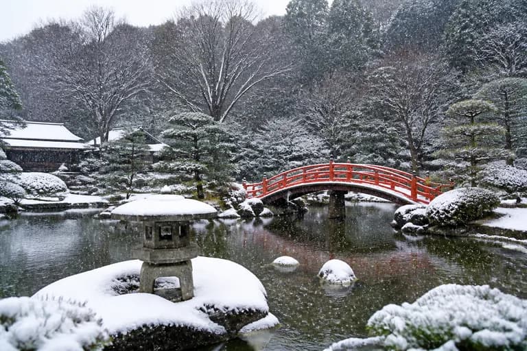
What an AI image generator actually is
An AI image generator is a tool that turns a written description into a picture. You type a sentence — "a red fox sitting in snow at sunrise, soft light" — and a neural network produces an original image matching it, usually in a few seconds. The image is not retrieved from a database and not stitched together from existing photos: it is synthesized pixel by pixel, a new picture that has never existed before.
This matters because it collapses the distance between having an idea and having a visual. Before, producing a custom image meant drawing it, photographing it, hiring someone, or settling for the closest stock photo. Now the bottleneck is language: if you can describe what you want with a little precision, you can have a usable version of it in the time it takes to type. That shifts image-making from a specialist skill to a general one, the way word processors shifted typesetting.
It is equally important to understand what a generator is not. It is not a search engine, so it cannot show you a real place or a real event as it actually looked. It is not a mind reader, so vague prompts produce generic images. And it is not a finished-art machine — it is a fast, tireless first-draft artist whose output you steer, curate and refine. Users who treat it as a collaborator rather than a vending machine get dramatically better results.
How text-to-image models work, without the math
Modern generators are built on diffusion models. During training, the system is shown hundreds of millions of image–caption pairs and learns a two-way association between words and visual patterns: what "fox" looks like, what "sunrise light" does to colors, how "watercolor" differs from "photograph". Separately, it learns to reverse a process of gradual noising — taking an image that has been degraded into static and reconstructing what was there.
Generation runs that reconstruction in reverse from pure noise. The model starts with a canvas of random static and, over a series of steps, removes noise while being guided by your text prompt: at every step it nudges the emerging image toward something a human would caption with your words. Early steps settle broad composition — where the fox is, where the horizon sits — while later steps resolve fur texture, snow sparkle and edge detail.
Two practical consequences fall out of this design. First, randomness is a feature: the same prompt produces a different image each run because each run starts from different noise, which is why regenerating is a legitimate technique rather than a workaround. Second, the model reproduces statistical patterns, not rules — it has seen countless hands but never learned that hands have exactly five fingers, which explains the famous failure modes we will cover honestly later.
Your first prompt: from vague idea to precise description
The single biggest quality lever is the prompt, and the core principle is simple: the model fills every unspecified detail with a statistical average. "A dog" produces the most average dog in the most average setting. "A golden retriever puppy asleep on a striped blanket, morning window light, shallow depth of field" produces something you might actually keep. Specificity is not fussiness — it is the steering wheel.
A reliable prompt structure has four parts: subject, setting, style, and light or mood. Subject first, described with an adjective or two: "an elderly fisherman with a white beard". Then setting: "repairing a net on a wooden dock". Then style: "documentary photograph" or "soft watercolor illustration". Then atmosphere: "overcast morning, muted colors". You do not need poetic language — the model responds to concrete nouns and visual adjectives, not to eloquence.
Compare the difference in practice. Weak: "a logo for a coffee shop". Strong: "minimalist logo, a steaming coffee cup formed by a single continuous line, warm brown on cream background, flat vector style". Weak: "fantasy landscape". Strong: "floating islands with waterfalls spilling into clouds, golden hour, epic wide shot, detailed digital painting". In both cases the strong version is barely longer — it is simply more decided. Deciding is the work; typing is trivial.
Advanced prompting: composition, cameras and negative space
Once the basics feel natural, borrow the vocabulary of photography and art direction, because the model learned from images captioned with it. Framing terms work: "close-up portrait", "wide establishing shot", "bird's-eye view", "low angle looking up". Lens language works: "85mm portrait lens, blurred background", "macro shot of dew on a leaf". Lighting terms are the most powerful of all: "golden hour backlight", "soft studio lighting", "dramatic side light", "neon glow at night" each transform the same subject completely.
Composition instructions help when you need room for something else. "Centered subject, plain background, lots of negative space on the right" gives you a banner with a natural text zone. "Symmetrical composition" suits logos and posters; "rule of thirds, subject on the left" reads instantly as editorial photography. Color direction is similarly cheap and effective: "muted earth tones", "vibrant teal and orange", "monochrome with one red accent".
Finally, learn to iterate deliberately instead of re-rolling blindly. Change one variable at a time — keep your subject and swap the lighting, or keep everything and change the style — and you quickly learn what each phrase contributes. Save prompts that work; a personal library of five proven prompt skeletons, each with slots for the subject, outperforms starting from a blank line every session.
Style guide: photorealistic and illustration
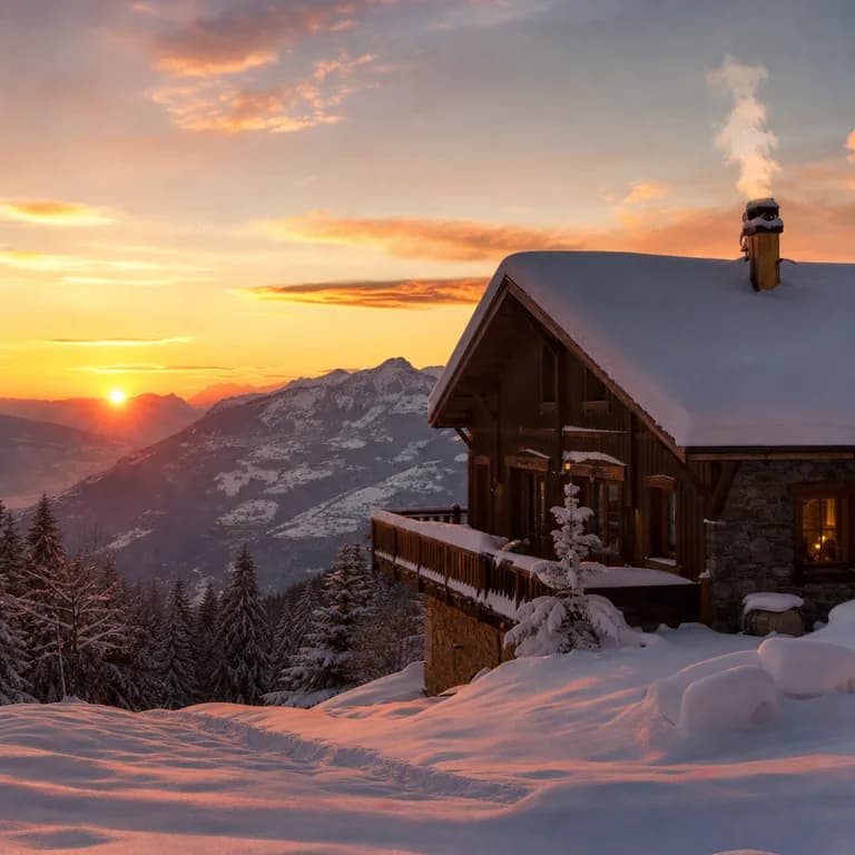
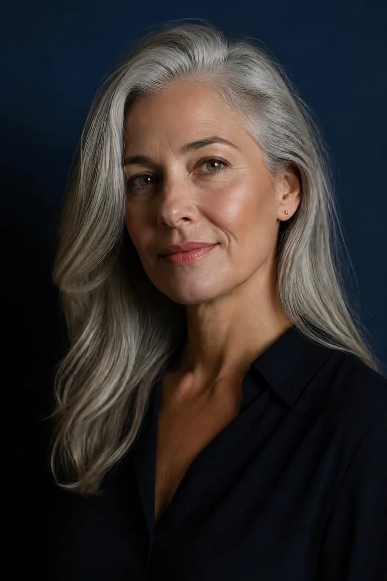
Photo style aims for images that read as camera output: believable materials, physical lighting, real-world depth of field. Choose it for product mockups, food and interior visuals, lifestyle scenes for websites, and any context where illustration would feel too casual. It rewards camera vocabulary — "shot on a 50mm lens", "natural window light", "shallow depth of field" — and punishes vagueness more than any other style, because our eyes are ruthless critics of almost-real images.
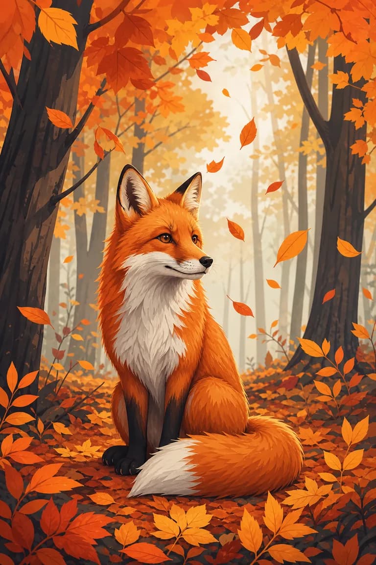
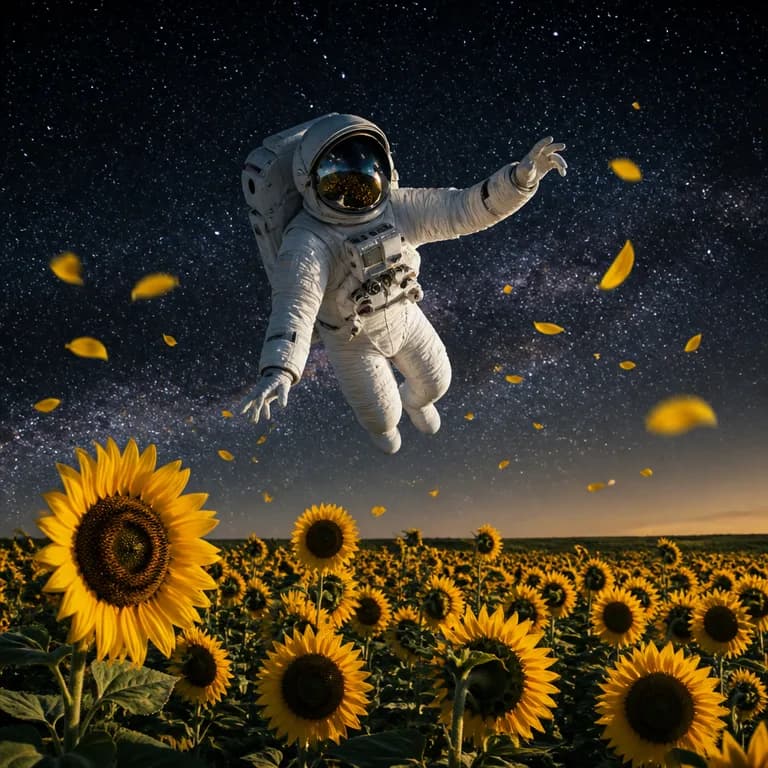
Illustration style covers the broad territory of drawn and painted looks: flat vector art, editorial illustration, children's-book warmth, digital painting. It is the workhorse for blog headers, presentation art, app onboarding screens and social graphics, because it communicates ideas without pretending to document reality. Abstract concepts — "teamwork", "data privacy", "growth" — are far easier to depict as illustration than as photography, and small imperfections that would ruin a photoreal image simply read as artistic character here.
A useful decision rule: if a viewer might reasonably ask "is this a real photo?", and the honest answer being no would undermine you, use illustration. Product listings, real-estate visuals and anything evidentiary should either be real photographs or clearly stylized art — the uncanny middle ground erodes trust precisely because it is good enough to be mistaken for documentation.
Style guide: logo, watercolor, 3D and pixel art
Logo style produces flat, simplified, mark-like designs: strong silhouettes, limited palettes, clean geometry. Use it to brainstorm brand directions — generate twenty candidates in ten minutes, pick the two ideas worth pursuing, then have the winner redrawn as a true vector for production. Prompt with the essentials: the motif, "minimalist flat logo", the palette, and "white background" so the mark is easy to extract.
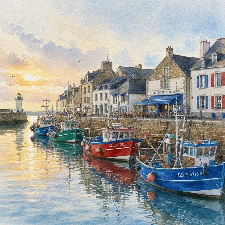
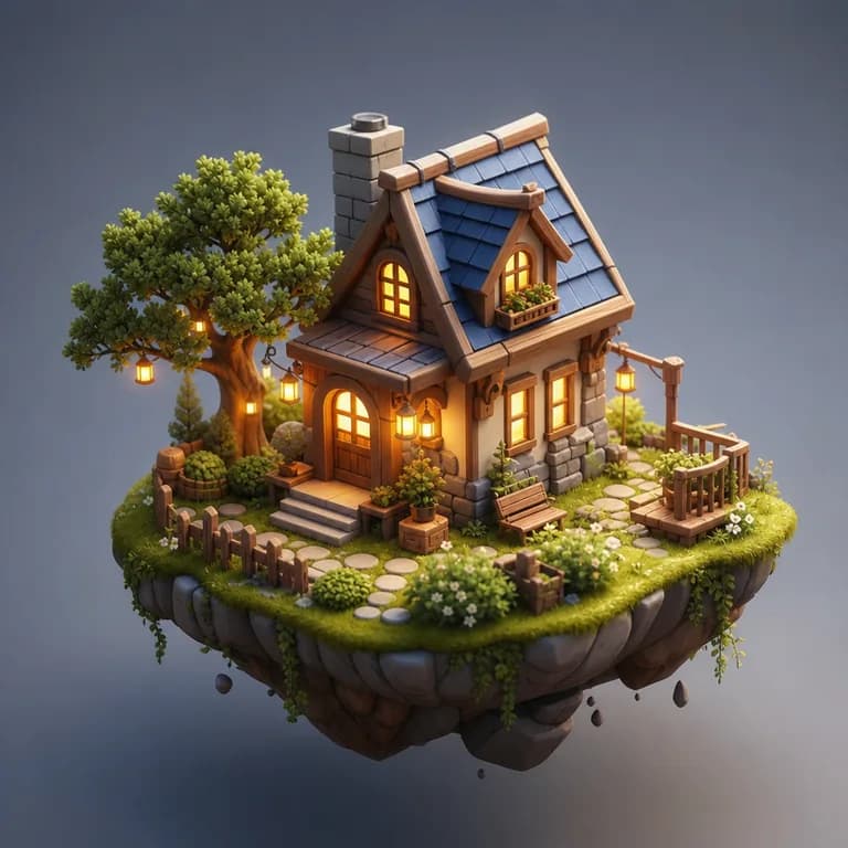
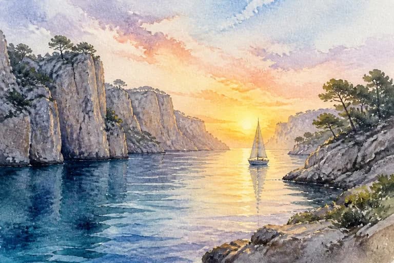
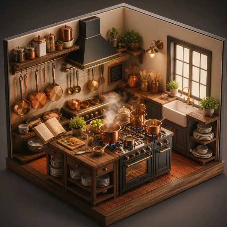
Watercolor delivers soft pigment washes, visible paper texture and gentle color bleeds. It flatters organic subjects — florals, landscapes, animals, food — and carries an emotional warmth that suits wedding stationery, greeting cards, poetry-adjacent social posts and gift art. 3D style renders subjects as if from Pixar-grade software: rounded forms, glossy materials, soft studio shadows. It has become the default look of modern tech marketing — friendly mascots, floating interface icons, playful product scenes.
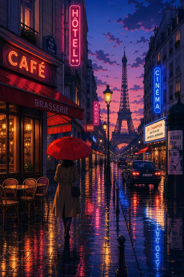
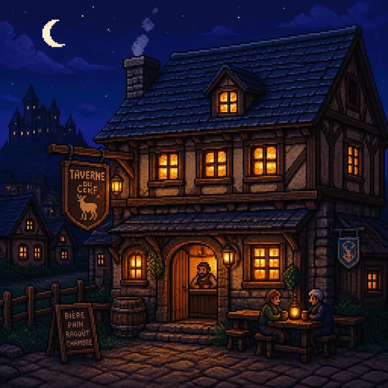
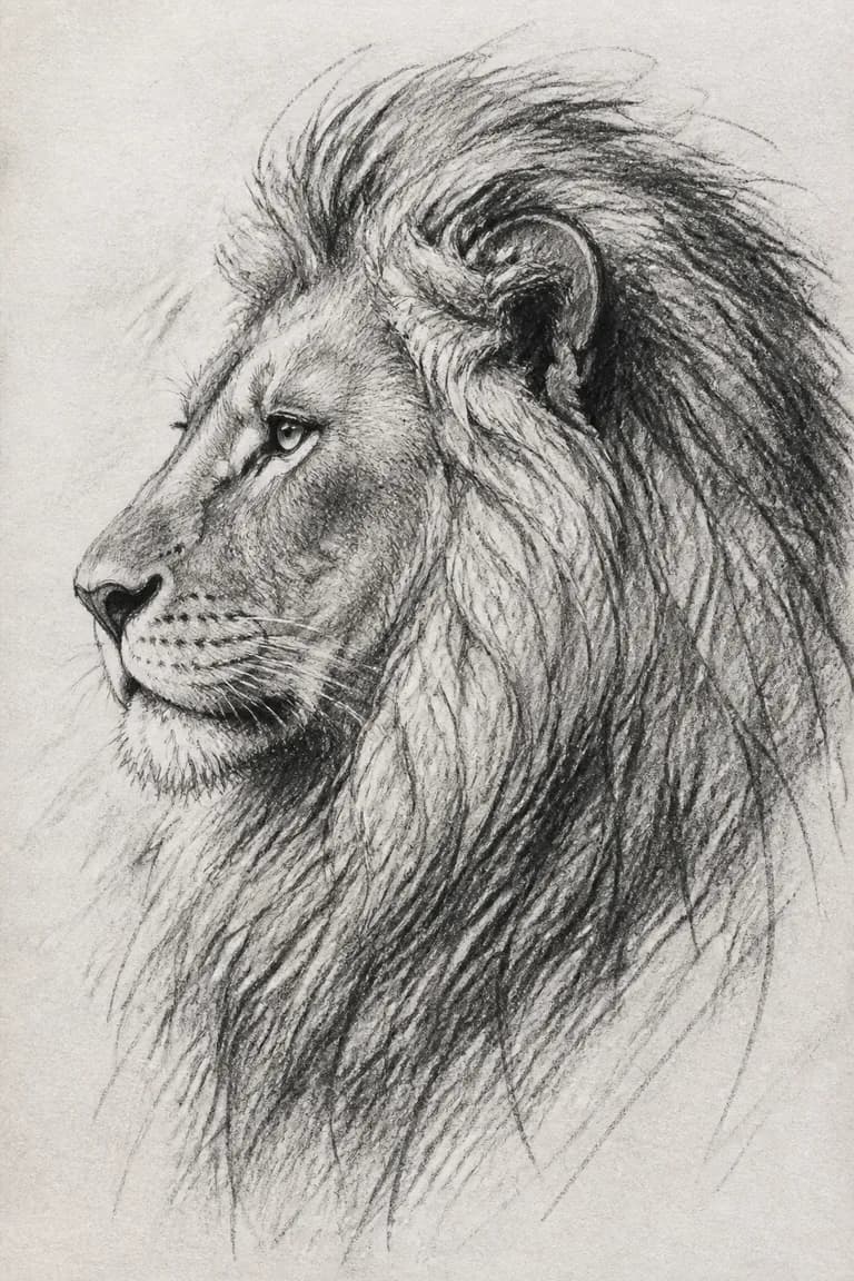
Pixel art recreates the deliberate low-resolution aesthetic of retro games: chunky pixels, tight palettes, instant nostalgia. It is beloved for game prototypes, Discord and stream assets, and any project trading on 8-bit charm. Anime style draws on Japanese animation conventions — expressive eyes, clean line work, dramatic skies — and is a staple for avatars, fan art and youth-oriented content. Sketch style, finally, mimics pencil and ink drawing; it is the quiet one, ideal for elegant portraits, architectural concept lines and storyboards where a "work in progress" feel is exactly right.
- Photo: product mockups, food, interiors, lifestyle scenes — anywhere realism builds trust
- Illustration: blog headers, presentations, abstract concepts like growth or teamwork
- Logo: fast brand brainstorming — generate twenty marks, redraw the winner as a vector
- Watercolor: florals, animals, food, cards and stationery — warmth over precision
- 3D: tech marketing, friendly mascots, app icons and playful product scenes
- Pixel art: game prototypes, stream assets, retro-flavored social posts
- Anime: avatars, fan art and youth-oriented content with expressive characters
- Sketch: elegant portraits, architecture concepts and storyboards with a hand-drawn feel
Choosing a format: square, portrait and landscape
Aspect ratio is a content decision, not a technicality, because every platform crops or letterboxes whatever does not fit. Square (1:1) is the universal safe format: Instagram feed posts, profile pictures, album-style grids and marketplace thumbnails all present square cleanly. When in doubt, and especially for anything destined to be a small clickable tile, square wastes the fewest pixels.
Portrait (vertical) formats own the phone screen. Stories, Reels, TikTok and Pinterest all favor tall images that fill the display edge to edge, and a 9:16 or 2:3 generation simply looks native there in a way a cropped square never does. Vertical also flatters standing subjects — people, bottles, buildings, book covers — by matching the frame to the subject's own geometry.
Landscape (horizontal) is the format of desktop and cinema: YouTube thumbnails, blog headers, website heroes, presentation slides, Twitter/X cards. Wide frames excel at scenes and context — a landscape, a room, a workspace — and leave natural side space for headlines and interface elements. The professional habit is to decide the destination before generating: composition the model chooses for a wide frame differs fundamentally from what it chooses for a tall one, and cropping after the fact throws that intelligence away.
- Instagram feed post and profile grids: square (1:1)
- Stories, Reels, TikTok and Pinterest pins: portrait (9:16 or 2:3)
- YouTube thumbnails, blog headers and website heroes: landscape (16:9)
- Presentation slides and Twitter/X link cards: landscape (16:9)
- Phone wallpapers and book-cover mockups: portrait
- Marketplace and app-store thumbnails: square, with the subject centered
Use cases: content creators, marketing and small business
Content creators were the first to make AI images routine. Every blog post needs a header, every video needs a thumbnail, every newsletter needs something above the fold — and stock photos are expensive, overused and rarely exact. Generation inverts the economics: instead of browsing for the least-wrong existing image, you describe the precisely right one. Consistency compounds the benefit — reuse the same style phrase across a series and your channel develops a recognizable visual identity for free.
Small businesses use generation where they once used nothing at all. A café posts a watercolor of croissants for its Saturday special; a plumber's website gets clean 3D icons for each service; a market stall prints a generated poster for the weekend. These are businesses that would never commission illustration at agency prices, so the realistic alternative was text-only or clip art. The floor of visual quality across small-business marketing has visibly risen because of this.
Marketing teams use it earlier in the funnel: mood boards in minutes instead of days, five visual directions mocked up before briefing a designer, ad-concept variants to test before spending on production. The generator rarely produces the final shipped asset in professional contexts — but it compresses the exploratory phase, which was always the slow, expensive, meeting-heavy part.
Use cases: personal projects, education and game development
Personal use is the quiet majority of generation. Custom birthday cards with the recipient's hobbies painted into them; a watercolor of the family dog as a gift; D&D character portraits matching a backstory no stock image ever will; a unique phone wallpaper; decor prints sized for a hallway frame. None of this is commerce — it is the same impulse that fills craft stores, with the skill barrier removed.
Educators and students generate what textbooks lack: a picture of a specific historical scene for a slide, labeled-style illustrations of a process, visual writing prompts for a classroom, flashcard images for language learning. Because generation is instant and free, teachers can produce material tailored to this week's lesson rather than settling for whatever an image search surfaces — while teaching, along the way, a healthy lesson about what AI images are and are not.
Indie game developers and writers use generators as concept-art departments. Environment moods, character line-ups, item icons and cover-art drafts that would each cost hundreds from a freelancer can be explored in an evening, and pixel-art style in particular slots directly into prototypes. The mature workflow treats these as placeholders and inspiration: ship-quality game art still benefits from a human artist, but the artist now starts from a folder of decided direction instead of a vague verbal brief.
Fifteen prompt tips that actually move the needle
Prompting skill is mostly a collection of small habits, each worth a little, compounding into consistently strong results. The list below distills what experienced users do differently from beginners. None of it requires technical knowledge — only the discipline of deciding what you want before asking for it, and changing one thing at a time when you refine.
Treat the list as a checklist for images that matter and a diagnosis kit for images that disappoint. A generic result usually traces to tip one or two; a cluttered mess to tip five; a wrong mood to tips seven and eight. With a dozen generations of deliberate practice, these stop being tips and become instinct.
- Name a specific subject with one or two concrete adjectives — "a rusty red bicycle", not "a bike"
- Always state a style: photo, flat illustration, watercolor, 3D render, pixel art, ink sketch
- Describe the lighting — "golden hour", "soft studio light", "neon night" — it changes everything
- Set the mood in one word or two: cozy, dramatic, serene, playful, melancholic
- One idea per image; two competing subjects halves the quality of both
- Specify the framing: close-up, wide shot, top-down, low angle
- Direct the palette: "muted earth tones", "pastel pink and mint", "high-contrast black and gold"
- Add texture and material words: weathered wood, brushed metal, soft wool, wet asphalt
- Ask for negative space when you plan to add text over the image
- Use camera vocabulary for realism: "85mm lens", "shallow depth of field", "macro"
- Regenerate freely — the same prompt yields new compositions each run, and the third try often wins
- Change exactly one element per iteration so you learn what each phrase does
- Keep a personal library of prompts that worked, with a blank slot for the subject
- Match the aspect ratio to the destination before generating, not by cropping after
- Avoid prompting for long visible text; add real text later in Canva or any editor
Commercial use and image rights, plainly explained
The question every business user asks first: can I use these images commercially? As a general matter, images you generate here are yours to use, including for commercial projects — product visuals, marketing, covers, merchandise — with no watermark to remove and no license fee attached to the file. That baseline is far simpler than stock photography, where every image carries a license with usage tiers, seat counts and renewal terms.
Copyright itself is the more nuanced layer. In many jurisdictions, including current US Copyright Office practice, an image generated entirely by AI without meaningful human authorship is not eligible for copyright protection — meaning you can use it, but you may not be able to stop others from using an identical output. Practically, this matters for a company logo or flagship brand asset (where you want exclusive rights, so have a human designer finalize it) and matters very little for a blog header or a social post.
The genuine risks worth respecting are narrow and mostly obvious. Do not generate imitations of living artists' signature styles for commercial use; do not create images of real people, which good generators refuse anyway; do not fake documentary content — a generated "photo" of a real event presented as news is misinformation regardless of the tool. Inside those lines, everyday commercial use is uncontroversial and millions of businesses do it daily.
Honest limitations: hands, text and faces
Every generator has failure modes, and pretending otherwise helps no one. The most famous is hands: fingers may number four or six, bend at odd joints, or merge when two hands interact. It is improving with every model generation but not solved. The practical mitigations are composition-level: prefer poses where hands are relaxed, pocketed or out of frame, and when a result is 95% right except for a hand, crop — most great portraits do not include hands anyway.
Text inside images is the second classic weakness. Diffusion models paint the look of writing rather than spelling it, so a storefront sign or book cover often carries plausible-shaped gibberish. A single short word sometimes lands; a slogan almost never does. The professional workflow is settled: generate the artwork with clean space where the text belongs, then set real typography in an editor. This is genuinely better anyway — you get font control, perfect kerning and editability.
Faces of real, named people are refused by design, and this is a feature, not a gap: the same capability that could put your face in a flattering portrait could put anyone's face in a fabricated scene, and responsible tools decline the whole category. Generic faces, meanwhile, occasionally drift into the uncanny valley — eyes slightly asymmetric, teeth oddly counted. Regeneration usually fixes it; illustration styles avoid it entirely, because a stylized face makes no claim to photographic reality.
Beyond the famous flaws: consistency, counting and physics
Character consistency is the limitation that surprises people second. Generate a heroine for page one of a storybook and she will be a different woman on page two — same prompt, different face, different outfit. Diffusion models have no memory between generations. Workarounds exist: describe the character in exhaustive, repeated detail ("short red curly hair, round glasses, yellow raincoat") and accept approximate continuity, or design projects around scenes rather than a recurring star.
Counting and spatial logic are also probabilistic. Ask for "five apples" and you may get four or seven; ask for "the cup to the left of the book" and the layout is a suggestion at best. Complex prompts with several positioned objects tend to blend attributes — the red hat migrates onto the wrong figure. The mitigation is decomposition: generate simpler images and composite them, or relax the requirement when the exact count does not truly matter to the viewer.
Physics and fine logic fray at the edges: reflections that do not quite match the scene, shadows falling in two directions, bicycle chains routed impossibly, stairs that could not be climbed. Most viewers never notice at social-media size; engineers and cyclists notice immediately in their own domains. The rule of thumb — scrutinize generated images most where your audience has expertise — will serve you better than any list of specific flaws, because the flaws shrink with every model release while the rule stays true.
AI generation, stock photos and hiring a designer: an honest comparison
These three options solve different problems, and mature users mix them. Stock photography offers authentic, legally tidy images of real people and places instantly — but everyone else has the same library, the exact image you need rarely exists, and licensing costs recur. Generation offers the exact image you describe, instantly and without per-image fees — but it cannot show real places as they truly are, and photorealism of people carries the caveats covered above.
A human designer or photographer remains unmatched where it counts: strategic thinking, brand coherence across dozens of assets, revisions that understand why, and legal cleanliness including full copyright ownership. The honest framing is that AI compresses the bottom of the market — the $50 quick-turnaround tasks — while raising the value of the top: designers who direct AI tools deliver exploration speed and craft judgment.
A sensible decision rule for a small operation: use generation for volume and speed (posts, headers, drafts, mood boards), stock for authentic photos of real humans using real products, and professional design for the handful of assets that define you — logo, packaging, flagship campaign. Spending designer money where exclusivity and strategy matter, and generator time everywhere else, beats both the all-AI and the all-agency approach on any realistic budget.
Why good free tools have limits: the economics of 4 images a day
Unlike browser-side tools, image generation runs on serious hardware: each picture is computed on data-center GPUs that cost real money per second. Every generation therefore has a hard marginal cost to whoever operates the service. This is worth understanding because it explains the shape of the whole market — why some tools demand subscriptions before the first image, why others sell credit packs, and why "unlimited free generation" essentially does not exist anywhere, from anyone.
A daily allowance — here, 4 images a day at no cost, with no sign-up and no watermark — is the honest middle path. It is enough to try the tool for real and to finish a small job: a social post, a blog header, a couple of logo ideas refined once or twice. What it prevents is industrial-scale extraction by bots and bulk scrapers, which would otherwise consume the GPU budget that keeps the tool free for everyone else. The allowance renews on a rolling 24-hour basis; if a project needs more in one sitting, a paid plan lifts the daily limit.
The practical takeaway is to spend the allowance deliberately. Four thoughtful generations — each with a decided subject, style and framing, iterating one variable at a time — reliably produce more keepable images than dozens of vague re-rolls. The daily budget, oddly, makes most people better prompters: constraint forces the small act of deciding what you actually want, which was always the real skill.
A worked example: from idea to finished visual
Theory lands better with a concrete walk-through. Say you run a small bakery and want a warm Instagram post announcing weekend opening hours. Destination first: Instagram feed, so square format. Style next: photorealism would invite "is that really their bread?" doubts, so choose watercolor — warm, artisanal, honest about being art. Subject: not "bakery", but the specific scene — "a rustic wooden table with fresh sourdough loaves and croissants, steam rising from a coffee cup".
First generation: charming, but the table fills the frame with no room for your text. Refine one variable: append "soft empty space in the upper third". Second generation: composition works, but the palette runs cool. Append "warm golden morning light, cozy tones". Third generation: keepable. Total cost: three of the day's four free images and about four minutes. Add your opening hours as real text in any editor, sized into that empty upper third, and post.
Notice what made it work: format decided before generating, a style chosen for trust rather than maximal realism, a concrete scene instead of a category word, and one deliberate change per iteration. That loop — decide, generate, diagnose, adjust one thing — is the entire craft in miniature, and it transfers unchanged to logos, thumbnails, posters and every other visual you will ever need.
Getting started: your first session, well spent
The fastest way to learn is a structured first session rather than random typing. Pick one subject you genuinely care about — your pet, your product, your hobby — and generate it across four styles: photo, flat illustration, watercolor, 3D. Same subject, four looks; this teaches you more about style keywords in five minutes than any article can. Then take the style you liked best and run it through three lighting variants: golden hour, soft studio, dramatic night.
In your second pass, practice the format habit: generate the same concept as a square post, a vertical story and a wide banner, and notice how the model recomposes for each frame rather than merely cropping. Save the prompts that produced keepers, verbatim, somewhere you can find them — that library is the compounding asset. Everything here works without an account: on PixGenia the generator is free, watermark-free, and gives you 4 images a day to practice with.
Above all, keep expectations calibrated and curiosity high. You will hit a six-fingered hand and a gibberish street sign; crop the one and typeset over the other, as every practiced user does. The tool will not replace your taste — it will execute it faster than anything you have used before. Describe something specific, in a style you have chosen, lit the way you imagine it, and watch the distance between idea and image shrink to seconds.